
Email Usability: Designing for Mobile Readers Who Click
Email Usability: Designing for Mobile Readers Who Click
Why Mobile Email Design Matters More Than EverEmail marketing continues to deliver one of the strongest returns on investment in the digital landscape...
Why Mobile Email Design Matters More Than Ever
Email marketing continues to deliver one of the strongest returns on investment in the digital landscape, often outperforming other channels by a significant margin. Yet that return is only realised when your message is actually opened, read, and acted upon. And today, that action increasingly happens on a small screen. With a substantial share of email opens occurring on smartphones and tablets, designing for mobile is no longer optional—it is essential.
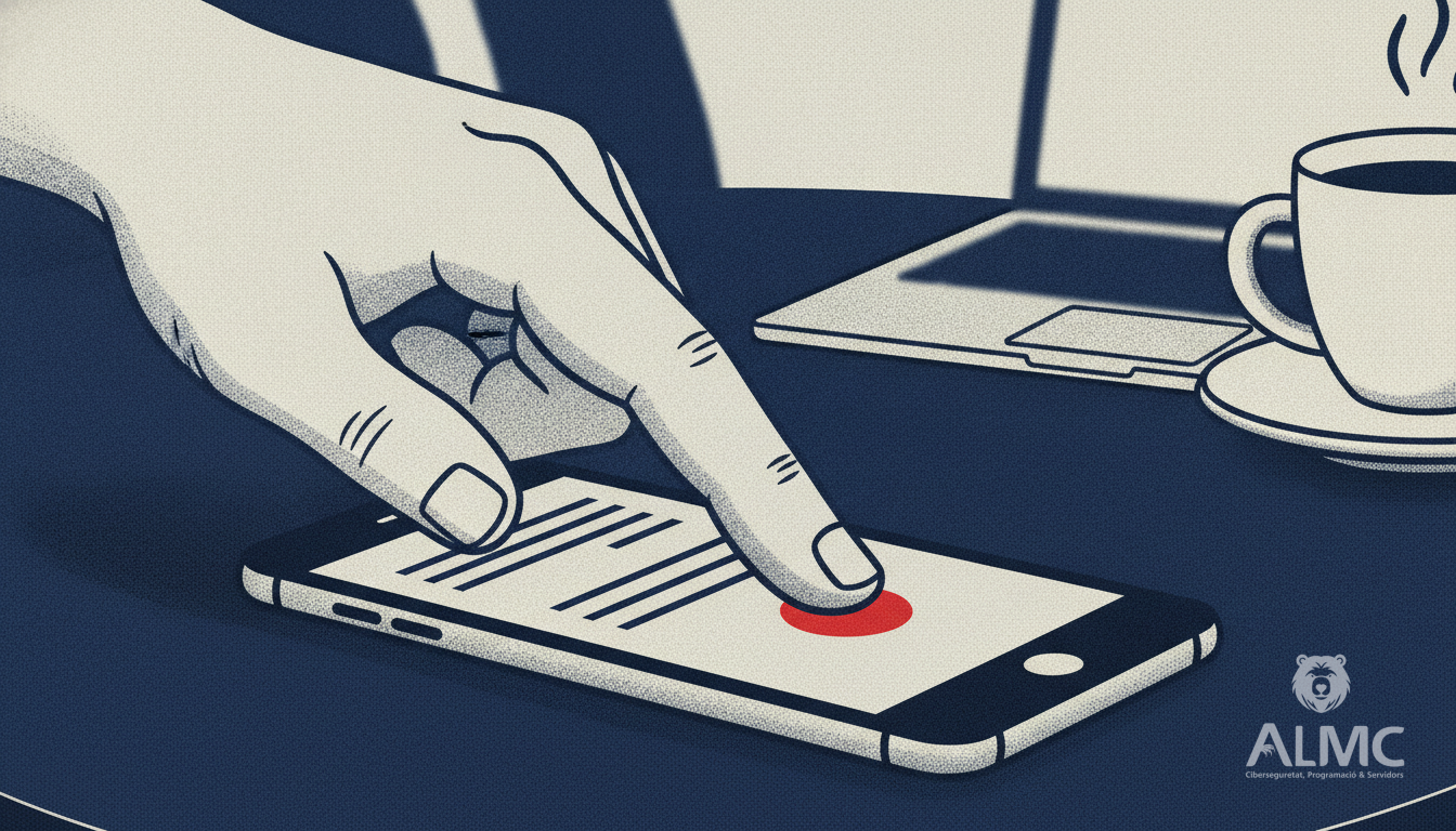
For businesses in Catalonia and across Spain, where mobile usage is among the highest in Europe, ignoring mobile usability means losing potential customers. Whether you are a small team in Lleida or a growing company in Barcelona, your email campaigns must be crafted to deliver a seamless experience on the go.
Key Principles for Mobile-First Email Design
To ensure your emails are not only seen but also generate clicks and conversions, keep these core principles in mind. They form the foundation of any successful mobile email strategy.
- Single-column layout: This structure adapts naturally to vertical scrolling, preventing content from breaking or becoming misaligned on smaller screens.
- Touch-friendly targets: Buttons and links should be at least 44x44 pixels, a standard that accommodates the average finger tap and reduces accidental clicks.
- Readable font sizes: Body text should be at least 16px to avoid the need for zooming, which frustrates users and increases bounce rates.
- Pre-send testing: Always preview your email in mobile view before sending. What looks perfect on a desktop may fall apart in Gmail on Android or appear unreadable in dark mode on an iPhone.
Crafting a Compelling Subject Line and Preview Text
The first battle is won or lost in the inbox. Before a recipient even opens your email, they decide based on three elements: sender name, subject line, and preview text. On mobile, this decision happens even faster, as screen space is limited and inboxes are crowded.
Studies indicate that a large percentage of recipients decide to open an email based solely on the subject line. If yours does not grab attention immediately, the rest of your content goes unnoticed. The solution is to put the most important information at the beginning. Keep subject lines concise—ideally under 50 characters—and use the preview text to complement them. For example, instead of a vague subject like “July news inside,” try “July is here: what you need to know” with a preview that adds value: “Templates ready, no code, in minutes.”
The preview text, often left blank or filled with a generic “View this email in your browser,” is a missed opportunity. Use it to extend your subject line and create a compelling reason to open. Together, they should form a mini-narrative that entices the reader.
Designing for the Thumb: Layout and Touch
Once your email is opened, the layout must guide the reader effortlessly. Multi-column designs that look great on a desktop can become chaotic on a phone, with elements stacking unpredictably and images distorting. A single-column layout is the safest and most effective choice for mobile. It respects the natural vertical scroll and creates a clear visual hierarchy.
When it comes to buttons, size matters. Small buttons are a common cause of lost conversions. Make sure every clickable element is large enough to be tapped comfortably. Also, ensure that buttons are placed within easy reach of the thumb, typically in the lower half of the screen. This reduces strain and encourages action.
Typography also plays a crucial role. Small fonts force users to pinch and zoom, which is a surefire way to lose their attention. Use a minimum font size of 16px for body text and even larger for headings. High contrast between text and background improves readability, especially in bright outdoor conditions or when dark mode is enabled.
Testing and Optimisation: The Final Step
No email should go out without thorough testing. Email clients render HTML differently, and what works in one may break in another. Before sending, preview your email on various devices and clients. Pay attention to how images load, whether fonts display correctly, and if any elements overlap. Testing helps you identify issues that could harm user experience and, consequently, your open and click rates.
Consider using email marketing platforms that offer built-in mobile preview tools. These allow you to see exactly how your email will look on popular smartphones and adjust accordingly. Remember, a well-tested email is a professional email.
Beyond Design: The Role of AI in Email Management
While design is critical, managing a high volume of incoming emails is another challenge that many customer support teams and SMEs face. Responding promptly and accurately to every query can consume hours of the day. This is where intelligent email assistants come into play. By leveraging artificial intelligence, these tools can classify incoming messages, retrieve relevant customer context, and suggest ready-to-send responses. This not only saves time but also ensures consistency and quality in communication.
For businesses looking to streamline their email operations, adopting an AI-powered assistant can be a game-changer. It allows your team to focus on complex issues that require human judgement, while routine queries are handled efficiently. This is particularly beneficial for small and medium-sized enterprises that may not have dedicated support staff.
Conclusion
Mobile email usability is not a trend but a necessity. By following the principles outlined above—single-column layouts, adequate touch targets, readable fonts, and thorough testing—you can create emails that are not only visually appealing but also drive engagement and conversions. Remember, the goal is to make the reading experience so smooth that the recipient is compelled to take the desired action, whether that is making a purchase, booking a service, or simply replying.
In a world where attention spans are short and competition is fierce, every detail counts. Start optimising your email design for mobile today and watch your open rates and click-through rates improve. And if managing your inbox becomes overwhelming, consider how AI can lighten the load, allowing you to focus on what truly matters—growing your business.
Related
- EU AI Act 2026: What It Means for Your Business and Team
- How to Learn Digital Marketing with No Prior Experience
- How to Choose a Digital Marketing Master's That Boosts Your Career
- Automatización
Put these ideas into practice
Talk to ALMC about a solution for your business. Explore your options or contact our team.